due for end of semester:
1) four psa posters
2) nine (or equivalent) posters 13" x 19" related to visual language topic (conceptual work, please) *
3) three posters of amy hempel quotes
4) one eight page zine, 8 1/2" x 11" folded and saddle stitched WITH CONTENT (not just a collage of random stuff, but real content, please)
everything posted to the blogs by friday, may 1st, midnite for grading
*if i asked you to do or redo the type specimen book, you are exempt from the visual language project.
Friday, April 17, 2009
Wednesday, April 8, 2009
Typotheque - History, the font of many fonts

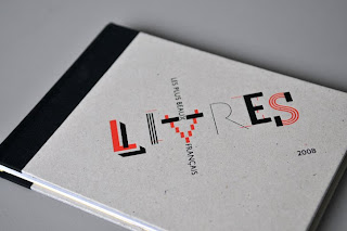


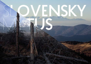
This is a pretty interesting font. Inspired by the evolution of typefaces, it consists of 21 layers that recombine in endless variations. Each layer is an independent typeface but all share the same proportions. I'm not sure how much this can be of use with this font in particular but thought this should be know to exist. I heard about this site and font from Michael Bebout. Thanks Michael. You can go to Typotheque and see more work in a section showing examples of all their fonts in use.
Monday, April 6, 2009
NEWWORK magazine
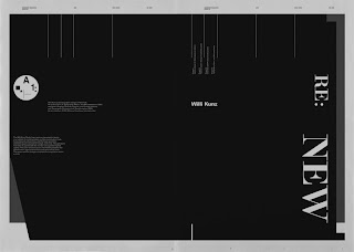
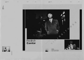
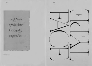
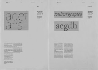
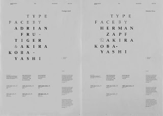
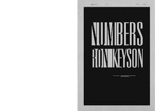
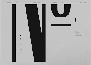
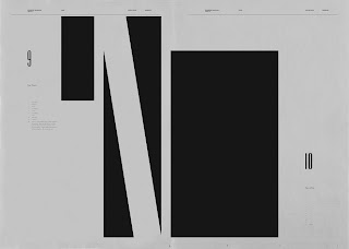
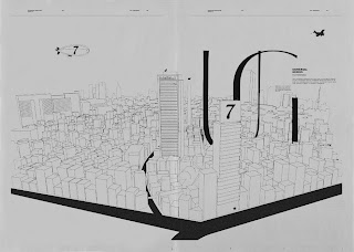
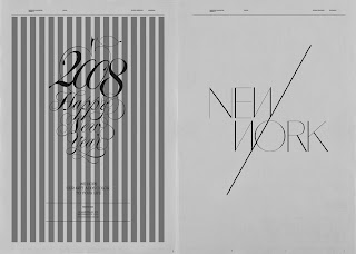
These are spreads from two issues of newwork magazine based in Brooklyn. It is a large-format (32"x23") magazine for fine art, design, high fashion and politics. The type in each spread makes it feels like a poster.
Sunday, April 5, 2009
All Things Typographic 4/09
Here is a source that goes in-depth with typography and has interesting things to look at and learn from.
This is from The Type Studio, founded by Ilene Stizver who was director of typeface development at ITC.
Below are some of the links for April's Q&A's and events. For the complete list, go to: All Things Typographic 4/09
-e
TypeTalk: You ask, we answer
Q. What is a font manager? Do I really need to buy one, since my Mac came with Font Book? Check it out...
Q. When starting a paragraph with a quotation, should the opening quotation marks sit outside the text so that it doesn't appear to be indented? Or can the opening quotation marks align with the line below? Check it out...
Q. Why is there such a big space between the r and t in some typefaces, and what should be done about it? Check it out...
Punctuation Positioning Sometimes a subtle adjustment in a character's position can make a big difference in the visual balance of your typesetting. Case in point: hyphens, en- and em-dashes, parentheses, braces and brackets will often look fine in lowercase settings, but can appear too low when set next to caps and lining figures. The larger the setting (in headlines, for example), the more noticeable this will be. What to do? Read on...

Periodic Table of Typefaces Cam Wilde from Squidspot created this table reminiscent of high school chemistry, but with typefaces replacing the elements, in addition to classification, designer, and year cleverly arranged. Don't you wish you thought of it first? See more...
Typography for Print: The Finer Points April 24, 9am to 4pm
Type Directors Club
347 West 36 Street, Suite 603
New York, NY
Learn the expert-level typographic skills and aesthetics necessary to master typography for print. This sessions will sharpen your eye and give you the practical skills that will visibly improve your type, as well as (re)ignite your passion for typography. Details...
This is from The Type Studio, founded by Ilene Stizver who was director of typeface development at ITC.
Below are some of the links for April's Q&A's and events. For the complete list, go to: All Things Typographic 4/09
-e
TypeTalk: You ask, we answer
~~~~~~~~~~~~~~~~~~~~~~~~~~~~~~~~~~~~~~~~~~
Q. What is a font manager? Do I really need to buy one, since my Mac came with Font Book? Check it out...
Q. When starting a paragraph with a quotation, should the opening quotation marks sit outside the text so that it doesn't appear to be indented? Or can the opening quotation marks align with the line below? Check it out...
Q. Why is there such a big space between the r and t in some typefaces, and what should be done about it? Check it out...
Punctuation Positioning
~~~~~~~~~~~~~~~~~~~~~~~~~~~~~~~~~~~~~~~~~~
 Sometimes a subtle adjustment in a character's position can make a big difference in the visual balance of your typesetting. Case in point: hyphens, en- and em-dashes, parentheses, braces and brackets will often look fine in lowercase settings, but can appear too low when set next to caps and lining figures. The larger the setting (in headlines, for example), the more noticeable this will be. What to do? Read on...
Periodic Table of Typefaces
~~~~~~~~~~~~~~~~~~~~~~~~~~~~~~~~~~~~~~~~~~
 Cam Wilde from Squidspot created this table reminiscent of high school chemistry, but with typefaces replacing the elements, in addition to classification, designer, and year cleverly arranged. Don't you wish you thought of it first? See more...
Typography for Print: The Finer Points
~~~~~~~~~~~~~~~~~~~~~~~~~~~~~~~~~~~~~~~~~~
 April 24, 9am to 4pm
Type Directors Club
347 West 36 Street, Suite 603
New York, NY
Learn the expert-level typographic skills and aesthetics necessary to master typography for print. This sessions will sharpen your eye and give you the practical skills that will visibly improve your type, as well as (re)ignite your passion for typography. Details...
Thursday, April 2, 2009
New Assignment - Create A Zine
create a zine:
using the many bits and pieces of great work you have lying around—
ideas that didn’t make it into a formal piece: drawings, poetry, writing, computer mess ups that you saved for a rainy day—
today is the day.
compile them together based on a theme, topic, subject—
something you feel passionate about.
cut and paste or tape them on four 8 1⁄2” x 11” pieces of paper.
make great compositions and interesting subject matter.
then copy on a copy machine.
make the copy machine work for you.
use both sides of the paper.
fold in half.
rethink the layout if needed and recopy.
then saddle stitch bind with a card stock cover.
use whatever paper stocks you find interesting and relate to your piece.
I’m thinking you can do this fast (3‐5 hours) and still create a strong portfolio piece.
it’s all in the swipe, subject due april 6th & 8th.
NO COMPUTERS!!
Have fun!
Subscribe to:
Posts (Atom)
