Saturday, September 26, 2009

Henrik Drescher


Here is some inspiration to maybe turn off your computer and draw, cut and paste stuff like the wildly talented, sleep-deprived graphic designers you are.

Henrik Drescher is an painter, illustrator and author of children's books.

From an interview,

Henrik Drescher is one of those artists that makes everything look far too easy. His style is overflowing with character and an enviable fearlessness to let his lines do what they want. There’s much to look at at his site, but if you’re stilla itching for more, you might also want to check out this interview with Drescher.

http://www.hermes.net.au/dpi/culturezone/dr01.html

Check out especially his illustrations, notebooks and sketchbooks, where he gets his ideas for his work.

http://www.hdrescher.com/

Friday, September 25, 2009

45 Beautifully Designed Book Covers

If you are looking for a little inspiration in the use of type and image check out this complied list of 45 Beautifully Designed Book Covers.

Thanks to Chris Sabatini.

On the Lighter Side...

In case anyone has been under a rock for the past few weeks you may not have heard about the font change going on over at Ikea.

Here is a nice little video giving the gist of this font fracas.

*WARNING: ONLY VIEW THIS VIDEO DURING YOUR 1 HOUR DINNER BREAK FROM DESIGN* J/K

Enjoy.

Courtesy of Design Observer

Thursday, September 24, 2009

Assignment for 9/28

Next Week's Assignment:

1) Read the first two chapters of Ellen Lupton's Thinking with Type ("Letter" and "Text")

2) Rework your type book (It must be a 16-page signature book).

3) Begin to integrate the images used in your Swatches Book in any manner you find appropriate for your topic.


Keep in my mind the concepts that were discussed in class. (i.e. grid)

Also keep in my mind that 'book' does not have to be taken literally.

Browse through blogs linked to Typobloger for examples.


Monday, September 21, 2009

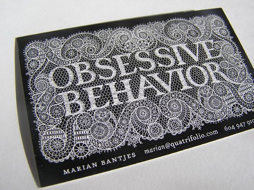
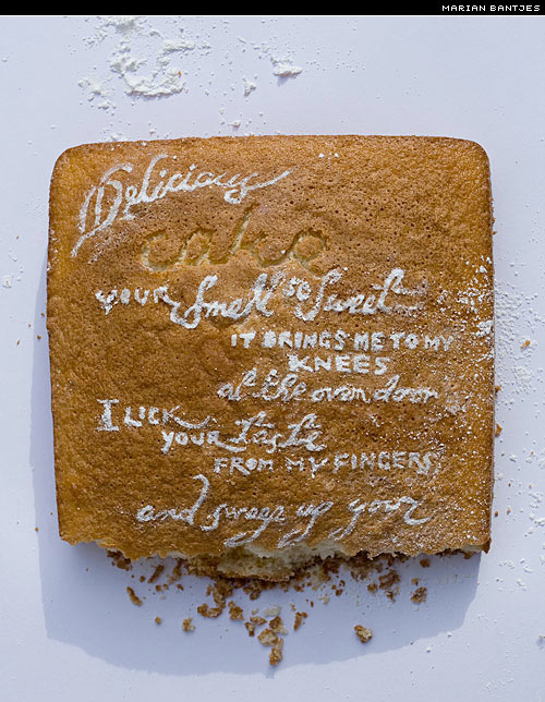
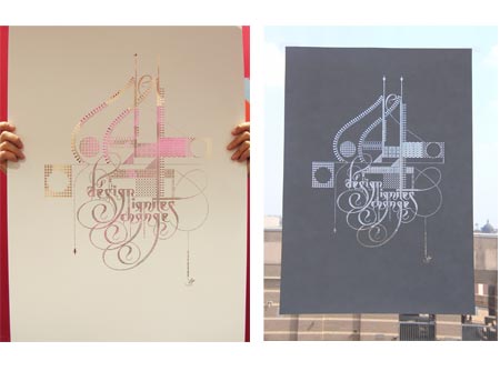
Typographer Spotlight: Marian Bantjes


Marian Bantjes:

Marian Bantjes, born 1963, is a Canadian typographer, artist, designer and writer. Bantjes started working in the field of visual communication in 1983 and worked as a book typesetter from 1984–1994. She became well known as a talented graphic designer from 1994–2003, when she was a partner and senior designer at Digitopolis in Vancouver, BC, Canada, where she created identity and communication designs for a wide range of corporate, education and arts organizations.

In 2003, Bantjes left her firm . She began work on her style of highly personal, ornamental, obsessive and at times, strange graphic work.

Bantjes's lovingly precise vector art, obsessive hand work, patterning and highly ornamental style have been sought after by such clients as Pentagram, Stefan Sagmeister, Saks Fifth Avenue, Bruce Mau Design, Young & Rubicam Chicago, Anni Kuan, Houghton Mifflin, Print Magazine, Wallpaper* , WIRED, The Guardian (UK), The New York Times, among others.

Her work has been featured in STEP, étapes (Paris), Azure, Matrix (Quebec) Tupigrafia (Brazil) and Print, Fontshop's Font 004, and

Eye magazine (#58).

Bantjes has been honored with numerous awards and her work is now part of the permanent collection at the Cooper-Hewitt National Design Museum.


-http://en.wikipedia.org/wiki/Marian_Bantjes


on a bizarre sidenote...

it is said her drawing hand is insured for 5 million dollars!


Sunday, September 20, 2009

Fonts from Neo2 Magazine


These department spreads are from Neo2 magazine, Spain's art, fashion and lifestyle magazine.

They have a fun style and you can download the fonts they use throughout the magazine for free and some pdf specials as well. Though, do beware, that the fonts don't always work.

(Thanks Ayca)

Student Type Specimen Work

Type Specimen pages by April Sharp:


Friday, September 18, 2009

Student type specimen work

Pages from David Robinson and Christopher Sabatini's Type Specimen books.

Due 9.23: Type specimen book

Type specimen book (16-page signature):

1) Pick 12 typefaces:
3 serif display
3 sans serif display
3 serif text
3 sans serif text

2) Design a David Berlow style type specimen book. Print to size,bound and bring to class. Here is the link to the David Berlow specimen pdf.


*DO NOT UPLOAD ALL THE FONTS ON THE LIBRARY TO YOUR COMPUTER. Store them and only upload those you need. Otherwise, you will crash your hard drives.

Wednesday, September 16, 2009

First Assignment: 24 page swipe book

For swipe book:
  • Pick a topic that interests you and that's not too broad. Write a paragraph describing it. Pick a target audience that's preferably close to yours.
  • Find sample images, a color palate and typography related to the topic. Print out and bind swipe book.
  • Create blog
  • Post it all to your blog
Deadline: 9.17 (if you didn't bring it to class, bring it next week)

Tuesday, September 15, 2009

TypeNeu


TypeNeu is a visual inspirational resource for all things new in the field of typography. They provide type inspiration, new fonts, free fonts, and type-related articles.

TypeNeu was founded in January 2008. Behind the concept, the design and the development of TypeNeu is the digital designer Emil Olsson.

Follow TypeNeu on twitter.

Some type inspiration from the site:

A free vector collection, fontfabric cube 02:
Second wave sans serif:
Portal, a free font:

Valentin Adam:

Saturday, September 5, 2009

All Things Typographic 9/09

TypeTalk: You ask, we answer
~~~~~~~~~~~~~~~~~~~~~~~~~~~~~~~~~~~~~~~~~~
TypeTalk Q. Is there a way to control line spacing in a Microsoft Word document besides the limited single, 1.5, and double options? Check it out...

Q. Great! Now how can I change the default line spacing for all new Word documents? Check it out...

Q. Why is the sentence "The quick brown fox jumps over the lazy dog" seen so often in type samples? Check it out...


Bullets (typographically speaking)
~~~~~~~~~~~~~~~~~~~~~~~~~~~~~~~~~~~~~~~~~~
fytilogo What kind of a bullet doesn't travel at high speeds and is completely non-violent? A typographer's bullet, of course! This very useful typographic element can add emphasis, clarity and visual interest to all kinds of copy. Read on...


Typography for Lawyers
~~~~~~~~~~~~~~~~~~~~~~~~~~~~~~~~~~~~~~~~~~
Lawyers A primer on typography for lawyers by Matthew Butterick, who studied typography and design at Harvard before becoming an attorney. Some very useful information for anyone using typography, not just lawyers! Take a look...


Movie Poster Typography
~~~~~~~~~~~~~~~~~~~~~~~~~~~~~~~~~~~~~~~~~~
FontFeed Check out The FontFeed's monthly review of typography in movie posters - what's hot, and what's not! Reviews include Public Enemies, Br�no, I Love You Beth Cooper, Blood, Soul Power, In The Loop, and more. Check it out...


For information on classes, go to the complete edition of this month