1. type specimen book--required DUE DATE, 9.22, 9.24
2. infographic--required DUE DATE, 10.20, 10.22
3. one of these below a-d--required DUE DATE, 11.10, 11.12
a. household item reassigned to new tool, branded, and repackaged with instructions
b. set text type book, 16 page signature or more, bind, soft or hard, your choice
c. pick up a brochure or give away pamphlet from your favorite store, redesign it, re-brand them
d. same as above, but promo mailer for yourself, including branding, etc
4. process book--required DUE DATE, 12.8, 12.10
collect all sketches, ideas, notes, comments, attempts, and finished pieces and bind them together in an "artist's" book/process book/portfolio book
if you've been blogging as requested, this last piece should almost do itself...
not really.
but, you should have everything you need to create it.
save those sketches, initial attempts, project notes
organize and explain
set those captions perfectly.
spell and grammar check (no spelling or grammar mistakes acceptable)

Monday, October 27, 2008
Thursday, October 23, 2008
New Type Foundry
Check out Josh Darden's type studio in brooklyn, DARDEN STUDIO.
&
Also check out TYPEFORYOU a nice forum w/ lots of good stuff including interviews.
CHECK IT OUT.
&
Check out Dino do Santos, a Portugese type designer who does some great work.
&
Check out more type at TYPETRUST.
&
look at this by Marion Deuchard.

&
Also check out TYPEFORYOU a nice forum w/ lots of good stuff including interviews.
CHECK IT OUT.
&
Check out Dino do Santos, a Portugese type designer who does some great work.
&
Check out more type at TYPETRUST.
&
look at this by Marion Deuchard.

Wednesday, October 22, 2008
Assignment #4 & Inspiration for setting a book
ASSIGNMENT #4
FINAL VERSION IS DUE THE WEEK OF NOV. 10th
(MONDAY class Nov. 10 & WEDNESDAY class Wed. Nov. 12th)
YOU MUST POST YOUR STUFF EVERY WEEK. POST UPDATES AND ALL.
*You have all done your household item assignment. Make sure that you make corrections. YOU SHOULD BE PERFECTING ALL YOUR PROJECTS AS WE GO ALONG.
The new assignment is:
select your favorite store
go and pick up one of their brochures/give away pamphlets
REDESIGN it in your own way!
You are giving them a new look.
Use strong typography.
Use their pictures, or re-shoot your own.
Make strong bold choices.
For example, you can go to G-STAR RAW, get their give away and redesign it. Or go to Urban Outfitters and get their catalogue and re- do it. Your design should be totally different from their. Have FUN!
*****
If you are doing the book setting assingment, here is a great example to look at.
Hey guys this was work done by Michael Bebout for Kafka's Metamorphosis.


Gail Anderson - For SVA
Here is Gail Anderson's very cool, nice, cover for the SVA Continuing Education Catalogue.


Sunday, October 19, 2008
New Assignment- DUE THE WEEK OF NOV. 10th
Pick one of these assignment.
FINAL VERSION IS DUE THE WEEK OF NOV. 10th
(MONDAY class Nov. 10 & WEDNESDAY class Wed. Nov. 12th)
YOU MUST POST YOUR STUFF EVERY WEEK. POST UPDATES AND ALL.
ASSIGNMENT #3
#1
1)Choose a household item, a tool of some sort, and invent a different usage for it.
2) Rebrand and repackage according to its new use.
3) Include "illustrated" instructions for usage.
Household tool could be anything from a hammer to a toothbrush, melon scoop, mousetrap, etc.
or,
#2
set a small book, a short story,
about the length of a signature or a little more.
kafka, the metamorphosis or some such.
you may use poetry.
(it can be tricky to set.)
take care with the text type, the chapter heads, the page numbers, the running heads, etc.
do an all type cover.
and a soft wrap.
unless you get motivated to do a hard cover.
i'm interested in the typography.
in how you make a simple book look interesting without using image.
*Make sure you find a good source to get the text from. Download from the web or such.
New Inspiration for Info-graphics.
These were designed by Bryan Farevaag.


Bookcovers that are great by Christopher Lin


Saturday, October 11, 2008
Downloadable templates?
Check out this link for DOWNLOADABLE templates you can use.
Designerstoolbox.com
Designerstoolbox.com
Friday, October 10, 2008
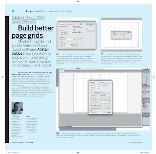
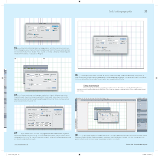
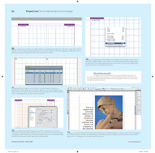
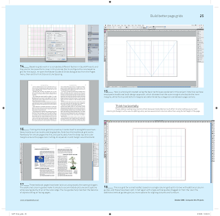
Making better page grids
Check this tutorial out to make Better Page Grids.
Its from Computer Arts Magazine,
the current issue deals with PRINT issues.
USE IT. It covers making grids in Indesign and Quark.
Check out their website, where they have lots of good tutorial PDF's.
*For a clearer version of the tutorial, click here to download the PDF
-ramon
Its from Computer Arts Magazine,
the current issue deals with PRINT issues.
USE IT. It covers making grids in Indesign and Quark.
Check out their website, where they have lots of good tutorial PDF's.
*For a clearer version of the tutorial, click here to download the PDF
-ramon


Thursday, October 9, 2008
Inspiration from Herb Lubalin
Thanks Ayca!

 Upper & Lower Case Mag


TypefaceDesigns

 Upper & Lower Case Mag


Logotypes


Posters


Editorial works


Tuesday, October 7, 2008
READ THIS --Building a type library
How to build a type library
by Ilene Strizver
by Ilene Strizver
 Designers frequently ask: What’s the best way to build a type library? With dozens of foundries and thousands of typefaces available, the task can be overwhelming. Here are some basic principles that will help you build the right library for your needs and budget.
One type at a time
A strong, versatile type library needn’t consist of hundreds of typefaces. In fact, many award-winning designers rely on a handful of font families for the majority of their work. Most independent designers and small creative departments will do best to build their type libraries one typeface at a time, on a project-by-project basis.
To select the right typeface or typeface family for a project, first do a thorough type exploration. Make a list of possibilities and put each design through its paces. If you don’t have printed specimen materials or catalogs, look for downloadable PDF showings; this is especially valuable if you’re choosing a text face. For headlines or other display usages, try viewing your candidates onscreen using font tryout utilities (these are commonly available on font foundry or reseller web sites).
Consider dozens of designs, if necessary, until you find the right one. This might take a while, but a well-selected, appropriate typeface can do more than half the work in creating a successful design. The hours spent will be well worth it!
When selecting text faces, make sure the family has all the versions you might need, including italics or obliques. Look for fonts that offer the features you use on a regular basis, such as small caps, ligatures, old style and lining figures. And you should seriously consider OpenType fonts, which have expanded character sets that often include all of the above features and more.
By developing your type library project by project, you’ll learn how each typeface looks and behaves in a variety of situations. The advantage of building your library this way is that you’ll be starting with fonts you know well and have already found pleasing and useful. They’ll be like old friends, and having a few good friends you can count on is better than having hundreds of acquaintances whom you know only superficially, right?
What To Avoid
If you want your work to be fresh and original, don't rely solely on the system and application fonts. Because of their widespread availability, these fonts have been tremendously overexposed and overused, especially by non-professionals. Even a good design can start to feel dated and stale through overuse. Many of the most-used system and application fonts have been around since the early days of desktop publishing, and are simply not good choices for serious design work.
Another warning: don’t waste your time on free fonts. Unless the fonts are offered by reputable foundries, the adage “you get what you pay for” applies. Good typeface design requires an experienced eye and a high degree of artistry and technical skill. Most free fonts are designed by type novices or hobbyists. Designers at the professional level rarely give their fonts away, and free fonts are generally not suitable for professional work.
Sunday, October 5, 2008
Info graphics inspiration
Everyone check out the Visual Complexity site for some excellent examples of intricate, exciting info graphics. Also below are examples from SVA students work from last year. Keep playing with your info graphics and pushing them into new territory.


And from this weekend's NY TIMES:


And from this weekend's NY TIMES:

Subscribe to:
Posts (Atom)