Monday, September 21, 2009

Typographer Spotlight: Marian Bantjes


Marian Bantjes:

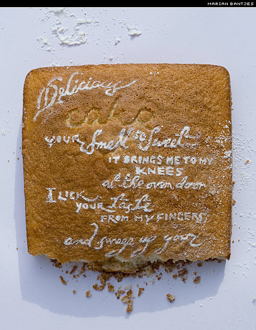
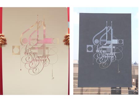
Marian Bantjes, born 1963, is a Canadian typographer, artist, designer and writer. Bantjes started working in the field of visual communication in 1983 and worked as a book typesetter from 1984–1994. She became well known as a talented graphic designer from 1994–2003, when she was a partner and senior designer at Digitopolis in Vancouver, BC, Canada, where she created identity and communication designs for a wide range of corporate, education and arts organizations.

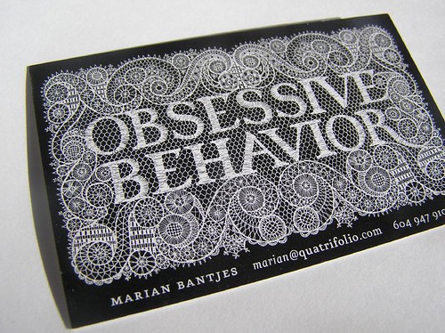
In 2003, Bantjes left her firm . She began work on her style of highly personal, ornamental, obsessive and at times, strange graphic work.

Bantjes's lovingly precise vector art, obsessive hand work, patterning and highly ornamental style have been sought after by such clients as Pentagram, Stefan Sagmeister, Saks Fifth Avenue, Bruce Mau Design, Young & Rubicam Chicago, Anni Kuan, Houghton Mifflin, Print Magazine, Wallpaper* , WIRED, The Guardian (UK), The New York Times, among others.

Her work has been featured in STEP, étapes (Paris), Azure, Matrix (Quebec) Tupigrafia (Brazil) and Print, Fontshop's Font 004, and

Eye magazine (#58).

Bantjes has been honored with numerous awards and her work is now part of the permanent collection at the Cooper-Hewitt National Design Museum.


-http://en.wikipedia.org/wiki/Marian_Bantjes


on a bizarre sidenote...

it is said her drawing hand is insured for 5 million dollars!


Sunday, September 20, 2009

Fonts from Neo2 Magazine


These department spreads are from Neo2 magazine, Spain's art, fashion and lifestyle magazine.

They have a fun style and you can download the fonts they use throughout the magazine for free and some pdf specials as well. Though, do beware, that the fonts don't always work.

(Thanks Ayca)

Student Type Specimen Work

Type Specimen pages by April Sharp:


Friday, September 18, 2009

Student type specimen work

Pages from David Robinson and Christopher Sabatini's Type Specimen books.

Due 9.23: Type specimen book

Type specimen book (16-page signature):

1) Pick 12 typefaces:
3 serif display
3 sans serif display
3 serif text
3 sans serif text

2) Design a David Berlow style type specimen book. Print to size,bound and bring to class. Here is the link to the David Berlow specimen pdf.


*DO NOT UPLOAD ALL THE FONTS ON THE LIBRARY TO YOUR COMPUTER. Store them and only upload those you need. Otherwise, you will crash your hard drives.

Wednesday, September 16, 2009

First Assignment: 24 page swipe book

For swipe book:
  • Pick a topic that interests you and that's not too broad. Write a paragraph describing it. Pick a target audience that's preferably close to yours.
  • Find sample images, a color palate and typography related to the topic. Print out and bind swipe book.
  • Create blog
  • Post it all to your blog
Deadline: 9.17 (if you didn't bring it to class, bring it next week)

Tuesday, September 15, 2009

TypeNeu


TypeNeu is a visual inspirational resource for all things new in the field of typography. They provide type inspiration, new fonts, free fonts, and type-related articles.

TypeNeu was founded in January 2008. Behind the concept, the design and the development of TypeNeu is the digital designer Emil Olsson.

Follow TypeNeu on twitter.

Some type inspiration from the site:

A free vector collection, fontfabric cube 02:
Second wave sans serif:
Portal, a free font:

Valentin Adam:

Saturday, September 5, 2009

All Things Typographic 9/09

TypeTalk: You ask, we answer
~~~~~~~~~~~~~~~~~~~~~~~~~~~~~~~~~~~~~~~~~~
TypeTalk Q. Is there a way to control line spacing in a Microsoft Word document besides the limited single, 1.5, and double options? Check it out...

Q. Great! Now how can I change the default line spacing for all new Word documents? Check it out...

Q. Why is the sentence "The quick brown fox jumps over the lazy dog" seen so often in type samples? Check it out...


Bullets (typographically speaking)
~~~~~~~~~~~~~~~~~~~~~~~~~~~~~~~~~~~~~~~~~~
fytilogo What kind of a bullet doesn't travel at high speeds and is completely non-violent? A typographer's bullet, of course! This very useful typographic element can add emphasis, clarity and visual interest to all kinds of copy. Read on...


Typography for Lawyers
~~~~~~~~~~~~~~~~~~~~~~~~~~~~~~~~~~~~~~~~~~
Lawyers A primer on typography for lawyers by Matthew Butterick, who studied typography and design at Harvard before becoming an attorney. Some very useful information for anyone using typography, not just lawyers! Take a look...


Movie Poster Typography
~~~~~~~~~~~~~~~~~~~~~~~~~~~~~~~~~~~~~~~~~~
FontFeed Check out The FontFeed's monthly review of typography in movie posters - what's hot, and what's not! Reviews include Public Enemies, Br�no, I Love You Beth Cooper, Blood, Soul Power, In The Loop, and more. Check it out...


For information on classes, go to the complete edition of this month

Wednesday, June 10, 2009


Made popular by the International Typographic Style movement and pioneered by legends like Josef Müller-Brockmann and Wim Crouwel, the grid is the foundation of any solid design. The Grid System is an ever-growing resource where graphic designers can learn about grid systems, the golden ratio and baseline grids.

Friday, April 17, 2009

End of Semester Work

due for end of semester:

1) four psa posters
2) nine (or equivalent) posters 13" x 19" related to visual language topic (conceptual work, please) *
3) three posters of amy hempel quotes
4) one eight page zine, 8 1/2" x 11" folded and saddle stitched WITH CONTENT (not just a collage of random stuff, but real content, please)

everything posted to the blogs by friday, may 1st, midnite for grading

*if i asked you to do or redo the type specimen book, you are exempt from the visual language project.

Wednesday, April 8, 2009

Typotheque - History, the font of many fonts


This is a pretty interesting font. Inspired by the evolution of typefaces, it consists of 21 layers that recombine in endless variations. Each layer is an independent typeface but all share the same proportions. I'm not sure how much this can be of use with this font in particular but thought this should be know to exist. I heard about this site and font from Michael Bebout. Thanks Michael. You can go to Typotheque and see more work in a section showing examples of all their fonts in use.

Monday, April 6, 2009

NEWWORK magazine


These are spreads from two issues of newwork magazine based in Brooklyn. It is a large-format (32"x23") magazine for fine art, design, high fashion and politics. The type in each spread makes it feels like a poster.

Sunday, April 5, 2009

All Things Typographic 4/09

Here is a source that goes in-depth with typography and has interesting things to look at and learn from.
This is from The Type Studio, founded by Ilene Stizver who was director of typeface development at ITC.
Below are some of the links for April's Q&A's and events. For the complete list, go to:
All Things Typographic 4/09

-e


TypeTalk: You ask, we answer
~~~~~~~~~~~~~~~~~~~~~~~~~~~~~~~~~~~~~~~~~~

Q. What is a font manager? Do I really need to buy one, since my Mac came with Font Book? Check it out...

Q. When starting a paragraph with a quotation, should the opening quotation marks sit outside the text so that it doesn't appear to be indented? Or can the opening quotation marks align with the line below? Check it out...

Q. Why is there such a big space between the r and t in some typefaces, and what should be done about it? Check it out...
Punctuation Positioning
~~~~~~~~~~~~~~~~~~~~~~~~~~~~~~~~~~~~~~~~~~
fytilogo Sometimes a subtle adjustment in a character's position can make a big difference in the visual balance of your typesetting. Case in point: hyphens, en- and em-dashes, parentheses, braces and brackets will often look fine in lowercase settings, but can appear too low when set next to caps and lining figures. The larger the setting (in headlines, for example), the more noticeable this will be. What to do? Read on...


Periodic Table of Typefaces
~~~~~~~~~~~~~~~~~~~~~~~~~~~~~~~~~~~~~~~~~~
periodic table Cam Wilde from Squidspot created this table reminiscent of high school chemistry, but with typefaces replacing the elements, in addition to classification, designer, and year cleverly arranged. Don't you wish you thought of it first? See more...


Typography for Print: The Finer Points
~~~~~~~~~~~~~~~~~~~~~~~~~~~~~~~~~~~~~~~~~~
handApril 24, 9am to 4pm
Type Directors Club
347 West 36 Street, Suite 603
New York, NY


Learn the expert-level typographic skills and aesthetics necessary to master typography for print. This sessions will sharpen your eye and give you the practical skills that will visibly improve your type, as well as (re)ignite your passion for typography.
Details...

Thursday, April 2, 2009

New Assignment - Create A Zine

create a zine:
using the many bits and pieces of great work you have lying around—
ideas that didn’t make it into a formal piece: drawings, poetry, writing, computer mess ups that you saved for a rainy day—
today is the day.
compile them together based on a theme, topic, subject—
something you feel passionate about.
cut and paste or tape them on four 8 1⁄2” x 11” pieces of paper.
make great compositions and interesting subject matter.
then copy on a copy machine.
make the copy machine work for you.
use both sides of the paper.
fold in half.
rethink the layout if needed and recopy.
then saddle stitch bind with a card stock cover.
use whatever paper stocks you find interesting and relate to your piece.
I’m thinking you can do this fast (3‐5 hours) and still create a strong portfolio piece.

it’s all in the swipe, subject due april 6th & 8th.

NO COMPUTERS!!

Have fun!

Tuesday, March 24, 2009

FontBook


This is a catalog book of 32,000 fonts...the most complete printed representation so far.
Check it out, you can buy it at Font Shop.
It's expensive, but who doesn't like seeing type in print?

Amy Hempel One Liners Assignment


CREATE : three posters 13” x 19” (or larger) using typography and image, or just typography.
CHOOSE : three of the below quotes as content for your posters, you may quote literally or extrapolate.
if you do use the quote as is, please credit the author:
amy hempel, the collected short stories, scribner, ny, 1985-2005.
DUE : march 25, 2009

Visual Language Book


CREATE: nine response posters 13” x 19” (or larger) using typography and image, or just typography.
CHOOSE: any or all of the below concepts
DUE: april 6th and 8th, 2009

Wednesday, March 18, 2009

All Things Typographic

Check out this weekly Q&A blog on Type by Ilene Strizver (The Type Studio)

Type Talk

You can send your questions at typetalk@typestudio.com

Questioning Authority, Rethinking Milgram's Experiments

A famous 1970s experiment was recently replicated,
revealing what it takes for us to question and resist those in positions of authority

http://www.alternet.org/rights/126492