Monday, November 24, 2008

Process Book Examples

by Elizabeth Shim
STATEMENT:
"This is a special format book of a series of articles about class in America that ran in New York Times. The book was designed to address the issues around class, and to offer a critical perspective on the nature of the articles. Physically, the binding never lets a spread fall into a comfortable position, much like the subject itself. The subheads of the article are printed on the inside of the French folds and run through the chapters, as reminders of yet another dimension. The layout is designed to twist the conventional hierarchy of a book page to reveal the stages of information and commentary around the articles. The quotes from the interviewees (most of these articles were written around interviews) were separated from the running text and put forward in the body area as the first source of information, the raw commentary on the issue of class. These quotes reveal the essence of the articles. The rest of the article, which is essentially commentary from the writer, runs in the secondary area of the page–the footnotes. The third area, marginalia, contains the commentary from the readers, posted on the online forum."


Sunday, November 23, 2008

From Cornel Windlin from LINETO

IDN: What is your philosophy on typography?

CW: "Many typographers show behavioral traits that include obsessive orderliness, rigidity, obstinacy, obsession with rules, excessive meticulousness and general ungenerousness. These characteristics correspond to Freud's definition of anal retention. Lineto strives for non-anal retention. Lineto strives for non-anal typography. We create our own tools for designing with type. After using them ourselves, we make them available for others to use."

– Cornel Windlin
IDN Magazine, 2006

Wednesday, November 19, 2008

New Inspiration


Keep working on that type and try new things.
here is a nice info-graphic from GOOD magazine.
font is Trade Gothic, looks so good!
-ramon

Tuesday, November 11, 2008

new inspiration

Look at these info-graphics from the NY Times.


Monday, October 27, 2008

Dates assignments due/mid semester unsatisfactory evals

1. type specimen book--required DUE DATE, 9.22, 9.24
2. infographic--required DUE DATE, 10.20, 10.22
3. one of these below a-d--required DUE DATE, 11.10, 11.12
a. household item reassigned to new tool, branded, and repackaged with instructions
b. set text type book, 16 page signature or more, bind, soft or hard, your choice
c. pick up a brochure or give away pamphlet from your favorite store, redesign it, re-brand them
d. same as above, but promo mailer for yourself, including branding, etc

4. process book--required DUE DATE, 12.8, 12.10
collect all sketches, ideas, notes, comments, attempts, and finished pieces and bind them together in an "artist's" book/process book/portfolio book
if you've been blogging as requested, this last piece should almost do itself...
not really.
but, you should have everything you need to create it.
save those sketches, initial attempts, project notes
organize and explain
set those captions perfectly.
spell and grammar check (no spelling or grammar mistakes acceptable)

Thursday, October 23, 2008

New Type Foundry

Check out Josh Darden's type studio in brooklyn, DARDEN STUDIO.
&
Also check out TYPEFORYOU a nice forum w/ lots of good stuff including interviews.
CHECK IT OUT.
&
Check out Dino do Santos, a Portugese type designer who does some great work.
&
Check out more type at TYPETRUST.
&
look at this by Marion Deuchard.

Wednesday, October 22, 2008

Assignment #4 & Inspiration for setting a book

ASSIGNMENT #4
FINAL VERSION IS DUE THE WEEK OF NOV. 10th
(MONDAY class Nov. 10 & WEDNESDAY class Wed. Nov. 12th)

YOU MUST POST YOUR STUFF EVERY WEEK. POST UPDATES AND ALL.
*You have all done your household item assignment. Make sure that you make corrections. YOU SHOULD BE PERFECTING ALL YOUR PROJECTS AS WE GO ALONG.

The new assignment is:
select your favorite store
go and pick up one of their brochures/give away pamphlets
REDESIGN it in your own way!
You are giving them a new look.
Use strong typography.
Use their pictures, or re-shoot your own.
Make strong bold choices.
For example, you can go to G-STAR RAW, get their give away and redesign it. Or go to Urban Outfitters and get their catalogue and re- do it. Your design should be totally different from their. Have FUN!

*****
If you are doing the book setting assingment, here is a great example to look at.
Hey guys this was work done by Michael Bebout for Kafka's Metamorphosis.


Gail Anderson - For SVA

Here is Gail Anderson's very cool, nice, cover for the SVA Continuing Education Catalogue.

Sunday, October 19, 2008

New Assignment- DUE THE WEEK OF NOV. 10th

Pick one of these assignment.
FINAL VERSION IS DUE THE WEEK OF NOV. 10th
(MONDAY class Nov. 10 & WEDNESDAY class Wed. Nov. 12th)

YOU MUST POST YOUR STUFF EVERY WEEK. POST UPDATES AND ALL.

ASSIGNMENT #3
#1
1)Choose a household item, a tool of some sort, and invent a different usage for it.
2) Rebrand and repackage according to its new use.
3) Include "illustrated" instructions for usage.
Household tool could be anything from a hammer to a toothbrush, melon scoop, mousetrap, etc.

or,

#2
set a small book, a short story,
about the length of a signature or a little more.
kafka, the metamorphosis or some such.
you may use poetry.
(it can be tricky to set.)
take care with the text type, the chapter heads, the page numbers, the running heads, etc.
do an all type cover.
and a soft wrap.
unless you get motivated to do a hard cover.
i'm interested in the typography.
in how you make a simple book look interesting without using image.
*Make sure you find a good source to get the text from. Download from the web or such.

New Inspiration for Info-graphics.
These were designed by Bryan Farevaag.


Bookcovers that are great by Christopher Lin


Saturday, October 11, 2008

Friday, October 10, 2008

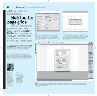
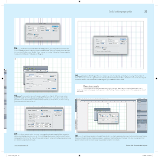
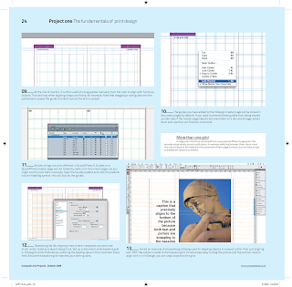
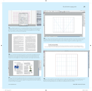
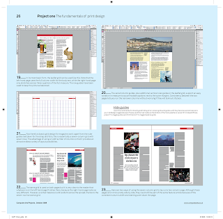
Making better page grids

Check this tutorial out to make Better Page Grids.
Its from Computer Arts Magazine,
the current issue deals with PRINT issues.
USE IT. It covers making grids in Indesign and Quark.
Check out their website, where they have lots of good tutorial PDF's.
*For a clearer version of the tutorial, click here to download the PDF

-ramon


Thursday, October 9, 2008

Inspiration from Herb Lubalin

Thanks Ayca!
TypefaceDesigns

Upper & Lower Case Mag


Logotypes


Posters


Editorial works